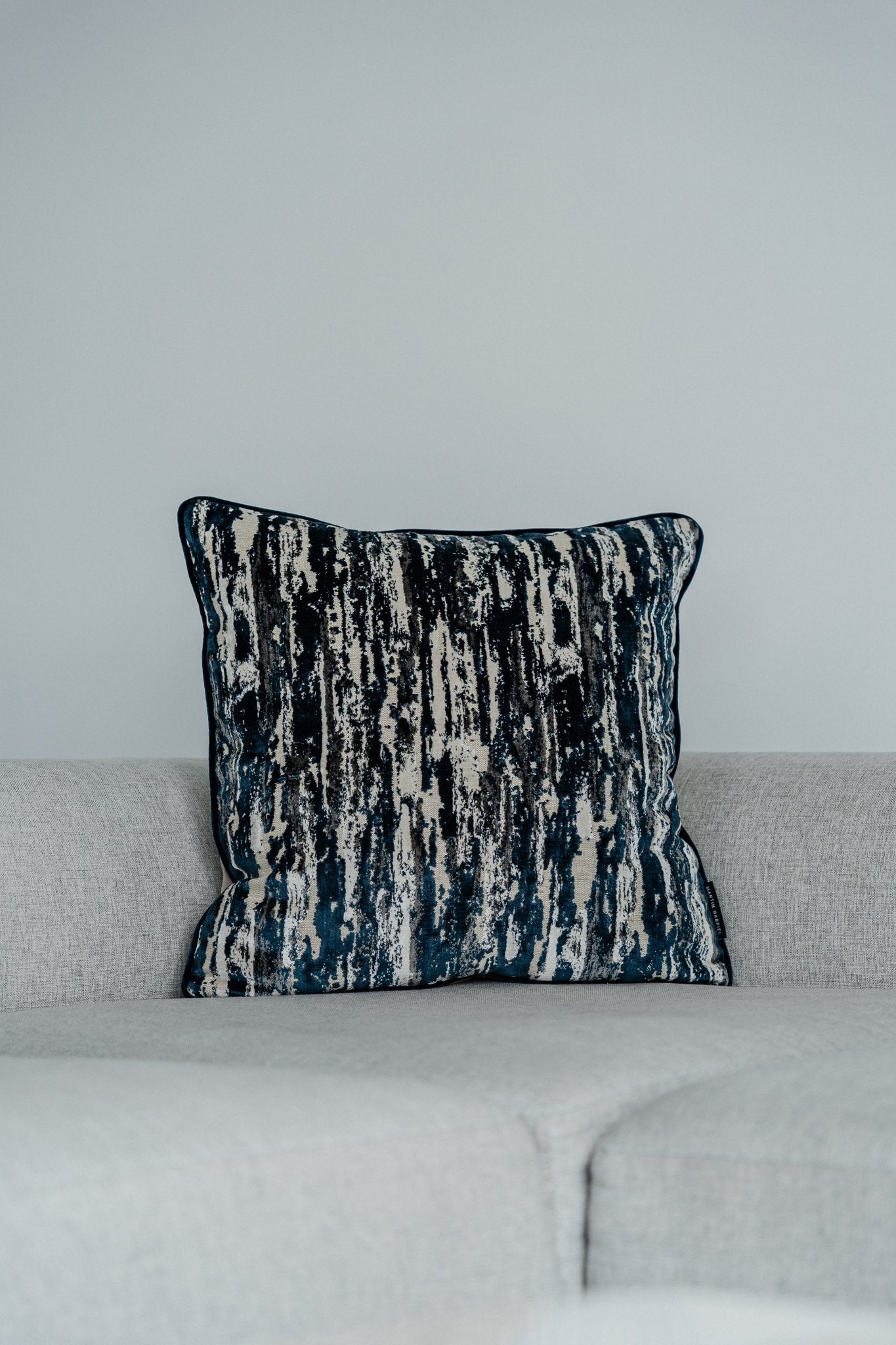
Clarity, poise, and a visible respect for materials and function: this triad has shaped Switzerland's design culture for decades. Thinking of the Alpine republic brings to mind precise clocks, legible signs, tranquil posters, luminous museums, and furniture that doesn't look dated even decades later. This effect isn't a coincidence, but rather a set of principles that transcends genre boundaries.
Roots of an attitude
The story doesn't begin in a studio, but in everyday life. Multilingualism, topographical diversity, a political spirit of balance, and a distinctive culture of craftsmanship have led to a design that inspires orientation and trust. The eye shouldn't struggle, it should find.
Starting in the 1950s, influential designers such as Max Bill, Josef Müller-Brockmann, Armin Hofmann, and Emil Ruder developed a visual grammar. The famous grid, strict typography, and the absence of ornamentation formed the basis of a design language that extended beyond graphic design into architecture, industrial design, and interface design.
This attitude is not ascetic, it is focused. Not less, but the right thing.
Basic principles that endure
- Reduction: Remove until nothing superfluous remains.
- Structure: order through grid, rhythm, proportion.
- Typography as architecture: Type creates spaces and directs lines of sight.
- Material honesty: wood remains wood, steel remains tangible steel.
- Precision: Manufacturing tolerances and line spacing with equal care.
- Function before form, with the highest quality in both.
This set of rules sounds strict, yet it still leaves room for flexibility. Art lies in the balance between rigor and warmth, technique and poetry.
Type as a system: From Helvetica to Frutiger
Typography is perhaps the most visible field. Swiss typefaces shape airports, operating systems, books, and brand identity across the planet. Their effect: restrained, open, and legible.
| Writing | Year | designer | character | Typical use |
|---|---|---|---|---|
| Helvetica | 1957 | Max Miedinger, Eduard Hoffmann | neutral grotesque, compact | Corporate design, guidance and orientation systems |
| Universe | 1957 | Adrian Frutiger | systematic, fine weight levels | complex typesetting, book and magazine design |
| Frutiger | 1976 | Adrian Frutiger | humanistic grotesque, high long-distance effect | Airports, Signage, Interfaces |
| Accurate | 2004 | Laurenz Brunner | sober, precise micrometrics | Interfaces, editorial design |
| Switzerland | 2011 | Swiss Typefaces | contemporary grotesque family | Branding, web typography |
Quality isn't just evident in the lettering. Spacing, tracking, line spacing, contrast between headline and body text: these micro-decisions create a calm overall impression. A Swiss poster doesn't work because it's loud. It works because nothing distracts.
Products that quietly convince
Anyone who reconfigures a USM Haller cabinet after twenty years understands longevity as a system. Anyone who observes Hans Hilfiker's SBB station clock recognizes the art of timing in the passing of seconds. Anyone who picks up a SIGG bottle senses the aluminum, which inspires trust through its shape and weight.
Some icons:
- Swiss station clock: simple indices, distinctive second hand, perfect readability.
- USM Haller: Modular tube-and-sphere system, easy to repair, timeless proportions.
- Victorinox pocket knives: multifunctional, precisely crafted, with a clearly defined haptic profile.
- Freitag bags: recycled truck tarpaulins, robust cuts, authentic patina.
- Swatch and Omega: from experimental color frenzy to classic dress watches, each precisely staged.
All these examples demonstrate that form not only follows function, but also durability. Those planning for long-term use design edges, hinges, radii, and surfaces for long cycles.
Architecture: Light, Material, Dimensions
Swiss spatial culture finds one of its strongest expressions in architecture. Peter Zumthor demonstrates how temperature, smell, and texture shape a building. Herzog & de Meuron transforms material research into precise visual worlds. Mario Botta works with geometry and layering. This work is not decoration, it is attitude.
It's about:
- Readability: Clearly structured floor plans, unambiguous paths.
- Lighting: Daylight as a building material, shadow as a design element.
- Material logic: stone, wood, concrete in their respective truth.
- Craftsmanship: Visible joints, controlled surfaces, dimensionally accurate details.
A museum today can look fresh again in ten years if its proportions are right and the choice of materials allows for aging gracefully.
From poster to pixel
The grid lives on. Not just on paper, but in design systems that ensure consistency in apps, websites, and software. Columns, rows, baselines, and hierarchies structure interfaces that remain calm even with high information density.
A few guiding principles from practice:
- Responsive grids with modular scaling instead of rigid breakpoints.
- Typographic scales that ensure clear jumps between headings, subheadings and body.
- Color palettes with few basic tones and clearly defined gradations.
- Component libraries that describe not only buttons, but interval, spacing and relationships.
Many of today's leading digital products use these principles intuitively or consciously. The effect is noticeable: less friction, more trust.
Color, white space, intensity
A persistent myth persists: Swiss design is black and white. A look at poster history debunks this. Bright red, bold green, clear blue, and generous white space. The secret lies in the proportions: strong, but controlled. A red element can shine when its surroundings are silent.
White space isn't empty. White space is rhythm. It gives information air and attention. In typography, it creates rhythm; in architecture, it creates perspective; in product design, it creates points of reference for the eye and hand.
Education and Culture
ETH Zurich, ECAL in Lausanne, and the Zurich University of the Arts (ZHdK) in Zurich: These institutions combine practical relevance with theory. Workshops, labs, seminars, and projects run parallel, rather than sequentially. Students learn to justify decisions, understand materials, and think in terms of systems.
Proximity to industry and craftsmanship is essential. Prototypes are created not only on paper or in CAD, but also on the milling machine, in the studio, and on the press. Anyone who knows how an edge folder works will design a radius differently.
Material honesty and sustainability
Timelessness is the most elegant form of resource conservation. A product that lasts for 20 years saves more than the best short-cycle recycling. Swiss designers therefore think in terms of durable connections, repairable systems, and modular extensions.
Examples of this way of thinking:
- USM Haller: Restock instead of disposing.
- Friday: Upcycling as a promise of quality, not as an excuse.
- Watch service: breathing new life into decades-old mechanics.
- Furniture with spare parts catalog: screws, fittings, surfaces interchangeable.
Then there's the choice of materials. Aluminum, steel, solid wood, and high-quality laminates age visibly, but gracefully. This patina isn't a defect, but a memory.
Three short case studies
-
The Swiss station clock
A clear circle, bold indices, a minute hand that neatly divides the dial, and a red second hand that ticks in time. The design technique behind it: optical centering, balanced contrast ratios, a play of hands that takes human perception into account. The effect: instant orientation. -
Swiss poster art of the 50s and 60s
Reduction in its purest form: a motif, a concise headline, a concrete grid. Müller-Brockmann's images demonstrate how musical rhythm can be translated into graphic order. Bold colors, large-scale typography, no playful illustrations. This sticks, holds, and remains. -
USM Haller in everyday office life
A shelf that grows with your needs. Not a disposable product, but a system. The ball joint forms the node from which almost any configuration can be derived. After years, it's a matter of remodeling, not purchasing. In times of short half-life cycles, this is a powerful counter-image.
Application in branding: A straightforward blueprint
Anyone who wants to build a brand with Swiss calmness works on structure, language, and details. A possible roadmap:
- Define a typography family with broad weight and language extension.
- Establish a grid that works in print, web, and presentations.
- Determine distances: vertical and horizontal intervals in a fixed ratio.
- Reduce the color palette to a few tones with clear responsibilities.
- Define components: headline, subline, copy, caption, quote, CTA.
- Sharpen the imagery: clear perspectives, calm backgrounds, real light.
- Create a documentation package that not only prescribes, but explains.
A brand does not win through complexity, but through repetition with quality.
Design mistakes that are easily avoided
- Too many fonts: One family with variants is enough. Two can be enough.
- No grid: A good system saves discussions and shortens review loops.
- Color without hierarchy: Cleanly stagger saturation and brightness.
- Decor instead of function: Form has a purpose. If it doesn't, delete it.
- Ignored production: Clarify how something is manufactured or printed before making a decision.
These points may sound banal, but they determine the impression. Calmness comes from consistency.
Precision and empathy
Precision without empathy becomes cold. Swiss design combines dimensional accuracy with human touch. A doorknob that understands the pressure of a hand. Signage that considers the needs of older eyes. An interface that formulates error messages respectfully. These subtleties aren't visible in the pitch, but they are noticeable in everyday life.
The language plays a role here. Clear words, short sentences, no false promises. Tones that explain rather than appease. The best typography is no use if the message is empty.
Research, technology, craftsmanship: a triad
Lasers, 5-axis milling, generative design, variable fonts, and intelligent materials are opening up new possibilities. The criteria remain crucial. A 3D-printed component only makes sense if it saves weight, simplifies assembly, or facilitates repair. A variable font is only valuable if it improves legibility in many environments and makes the design more systematic.
Switzerland offers excellent conditions for this: a strong research landscape, short distances to manufacturers, and a high level of quality awareness. Innovation here is rarely seen as a show, but rather as improvement in the details.
Questions that guide good design
- What should be understood in 30 seconds, what in three minutes, what in three hours?
- What decisions can the grid make to help creativity flow into the right problems?
- Where is reduction worthwhile, where is expression needed?
- Which parts need to be replaceable in five years?
- How does the object or surface communicate in the room, in daylight, in artificial light?
- Which words can be removed to make the important ones clearer?
The answers don't have to be spectacular. They must be robust.
A small tool set for everyday use
- Define scales: typo sizes, spacing, radii in a harmonious sequence.
- Test at a distance: evaluate poster, interface, product from two meters.
- Black and white test: Does it work without color? If so, use color selectively.
- Early production discussion: Clarify material, tolerances, and surface variants.
- Style tests in context: layout on a bus, clock in semi-darkness, furniture in slanting daylight.
This set saves time and increases the hit rate. Quality becomes predictable.
Why this attitude creates trust
People sense care. Even spacing is soothing. Precise edges signal precision. A typeface that doesn't loudly compete for attention invites reading. The result is a silent promise: someone has thought through this. This is precisely the essence of a design that doesn't aim to be fashionable, but rather useful, lasting, and beautiful.
Swiss work demonstrates how clarity and elegance are not mutually exclusive. A good object can be luminous yet subdued. A building can be powerful yet inviting. An interface can be fast yet courteous. Those seeking this quality will find a reliable foundation in the Swiss approach.
And maybe it all starts with a blank sheet of paper, a clear question and the courage to leave things out.